Small Business Website
https://www.madeingreenwich.shop/
I have started with a very basic small website. The reason why I have done this is because I think it is a great example of a very small local business using a Content Managment System effectively.
When I first visited this website back in 2018 it was not very visually appealing. I found it difficult to navigate. I have used an archive website to give a snapshot of how it used to look. There was not much to be found in the archive, but the first thing that is obvious is a strange use of large photos in the background.
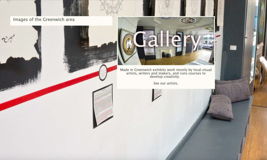
Over the last year they have switched to a different CMS, and now there are more useful navigation bars in addition to well thought out categories to browse. The asthetics of the website have also been pared down and it looks very modern and clean.
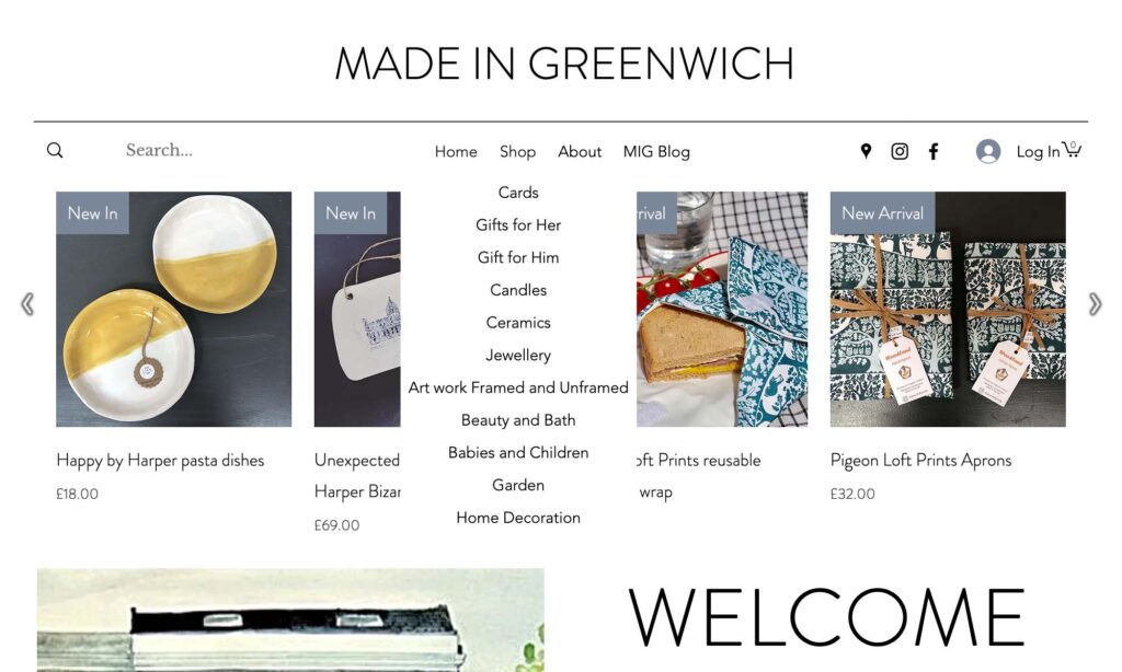
The functions that I like most are the two navigation bars. The first one is at the top of the page.
Most people will be visiting the site to purchase something, so the home page has a new arrivals display.
When I hover over “shop” I am offered some different categories that I might want to browse.
And then if I click on shop these categories are then shown on a new navigation bar on the left. I am also given some filter options and the opportunities to choose a specific local artist. The shop function mimics other more mainstream shopping websites such as ASOS. And as a user I am able to browse the different categories by just clicking on the left hand side.
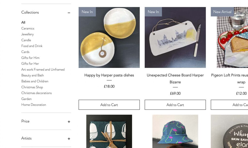
The aesthetics of the site are very basic. However the purpose of the website is to showcase local artists talents, so I think it it ideal for its purpose.
Superglow
This is an example that I found from Codrops “website of the week series”. I have chosen this as it is a follow on from the above concepts. That is that the site itself is very pared down in terms of content. But like the Made In Greenwich site that fits its purpose.
The website itself is a much more elevated example though.
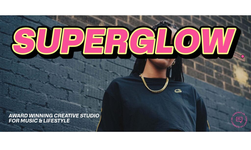
As you enter the site, you are met with a very large and loud name of the business. A large image, and a simple mission statement. As the browser of this site we now know immediately what the business is, and we can already make some assumptions of the target market with its choice of images and the bold statement colours from the logo and colour theme.
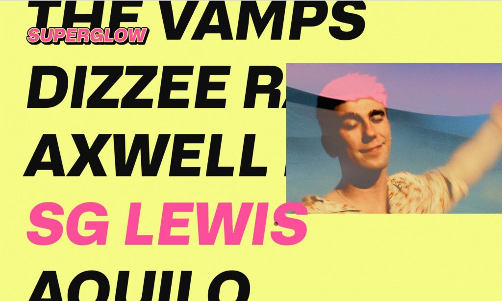
As you scroll down the site there is what appears to be a long list of names. However as you move across the names with your cursor and hover over a name, you are rewarded with a professional shot of the artist. It is clear that this is a showcase of the businesses creatives.
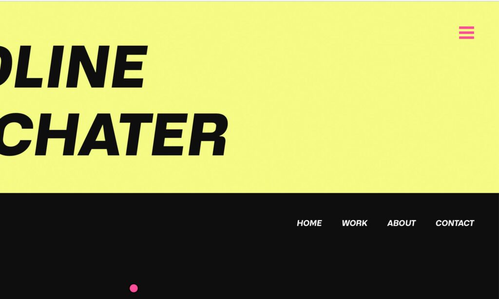
When you have scrolled to the bottom of the page you have a navigation bar. But what I like most about this site is that even as you scroll through the fancy function on the first page the icon for the navigation bar follows you (the three pink lines on the top right). So therefore you don’t have to move around at any point to find other areas of the site.
The Boat
https://www.sbs.com.au/theboat/
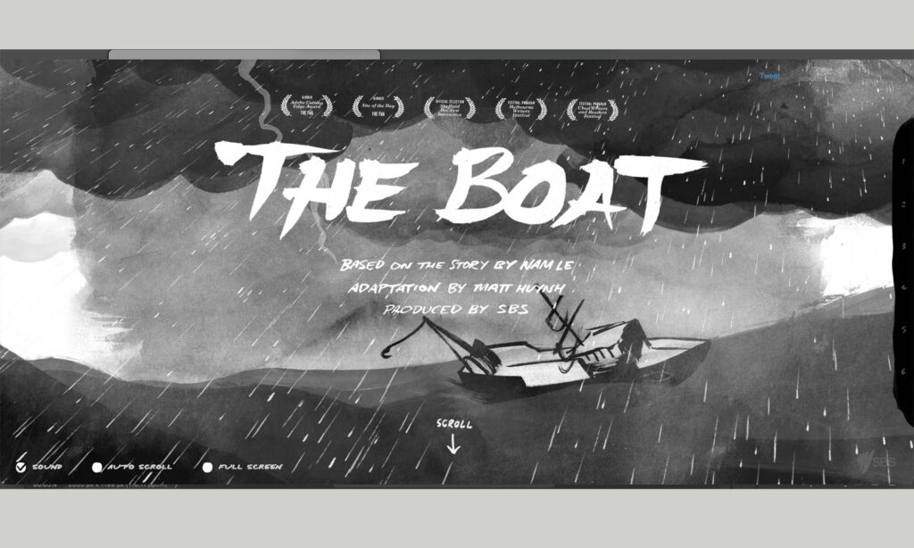
This is a web page rather than a website. I found this again from Codrops “website of the week” series. In this particular series they were focusing on content. This webpage is incredibly immersive. It is essentially an interactive book. Exploring the page is very easy, you only have to scroll down, and as you do the webpage changes to match the content that you are reading. It is a very unique way of reading a story.
How I Experience Web Today
https://how-i-experience-web-today.com/
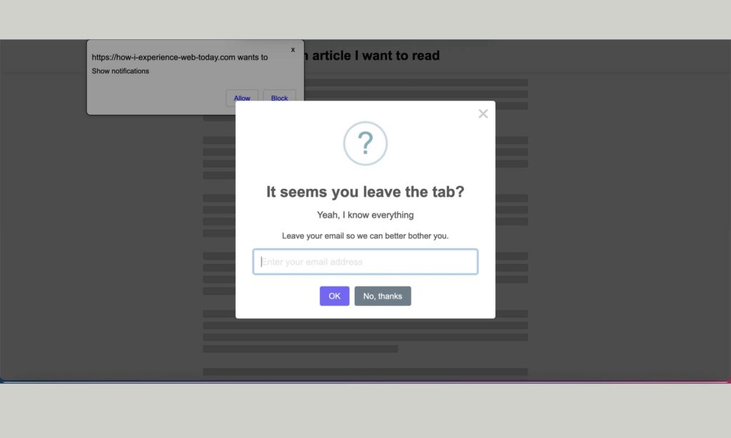
Again the thing I like most about the website is the actual content itself. My partner shared this website with me when I started to research a possible career in user experience design. The purpose of the website is to show you how this individual is frustrated with the web today and it highlights the elements that the creator dislikes as a user of the web.
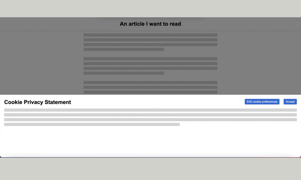
It’s incredibly annoying. As a user I enjoy this website, because the things the creator is pointing out are things that I have become so accustomed to, it’s just muscle memory to keep clicking “ok” and closing pop ups and so on. But by drawing my attention to it I can actually see that it is a problem. Whilst I might be accustomed to the annoying pop ups and questions, I now realise that they are subconsciously distracting me from being able to access my content. And after a while of too many interferences I might give up and try to find what I am looking for on another website instead.